New On-Air Look and Logo for an Audience and Company at Univision
January 29, 2019
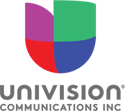 A fresh new on-air look across the network that introduces an updated Univision logo. These changes are part of a brand refresh that supports our internal positioning that captures succinctly what Univision is all about: “Bringing Together Hispanics on the Rise.” This campaign reinforces and expands on our commitment to elevate Hispanics by making them feel proud of their heritage, supported in their daily life, and optimistic about the future.
According to Jorge Dominguez, SVP, Creative Director:
- The new look emphasizes energy, optimism, passion and looking towards the future—qualities that describe both our audience and our company. Furthermore, this will better align the look of our network and local stations in a cohesive manner, which includes a modernized look for our Local News debuting this summer.
- The tweaks in the logo are relatively minor but give it a cleaner, more modern appearance and improve its usability across all our platforms. The logo, sometimes referred to as a tulip or a heart, retains its very recognizable central feature that carries a lot of equity for Univision and is so intimately familiar to our viewers.
- Both the new on-air look and updated logo are versatile and will lend themselves to all range of programming tone and personality, whether dramatic, romantic, comedic, serious, fast-paced, etc. To bring the essence and positioning of our brand to life, we worked with a highly experienced branding agency, Sibling Rivalry from NY, who truly understood and appreciated who Univision’s audience is and who they’re becoming—a community on the rise.